
Cannabis Packaging Design

Cannabis Packaging Design Brief
UpNorth Distribution, a pioneering cannabis company based in Arcata, CA, needed packaging that could do more than just comply with regulations — they needed packaging that would capture attention, reinforce brand identity, and boost sales in competitive dispensary environments.
As a freelance designer, I collaborated with UpNorth to create vibrant, eye-catching packaging for their pre-roll boxes and bulk cartons—turning every product into a true brand ambassador.
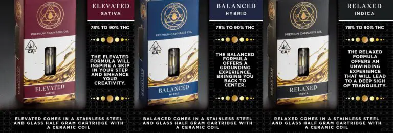
Project Scope: Complete packaging redesign for pre-roll individual boxes and bulk cartons.
Timeline: 6 weeks from initial consultation to final production files.
Deliverables: Production-ready print files with precise die line alignment, brand style guide updates, and packaging mockups.
The Challenge
The cannabis market is saturated with repetitive black-dominant packaging designs, making it hard for even quality brands to stand out. UpNorth needed a solution that would:
- Break away from common cannabis aesthetic clichés – Most dispensary shelves are dominated by dark, moody packaging that blends together, making individual brands nearly invisible to consumers browsing products.
- Maintain strong brand recognition with customers – UpNorth had built a loyal following in Northern California, and any redesign needed to preserve their existing brand equity while elevating their market presence.
- Align precisely with production die lines for flawless manufacturing – Cannabis packaging requires exact specifications to ensure child-resistant features, regulatory compliance labels, and structural integrity during shipping and handling.
- Enhance shelf presence while preserving the brand’s premium image – The packaging needed to be bold enough to catch attention from across a dispensary floor while still communicating quality and professionalism that justified their premium price point.
- Navigate complex regulatory requirements – California cannabis packaging must include specific warning labels, testing information, and child-resistant features while still leaving room for compelling brand storytelling.
Every detail—from color to layout—had to work in concert to outshine the competition.
Additional Design Constraints:
The project also had to address several technical and practical considerations that influenced the final design direction. Print production required CMYK color matching to ensure consistency across different print runs and packaging materials. The design had to work effectively at multiple scales, from individual pre-roll boxes measuring just a few inches to larger bulk cartons. Additionally, the packaging structure needed to accommodate various product weights and quantities while maintaining visual cohesion across the entire product line.
My Solution
I led a strategic redesign that elevated UpNorth’s brand through careful attention to visual hierarchy, production requirements, and market differentiation:
Color Strategy: Inverting Industry Norms
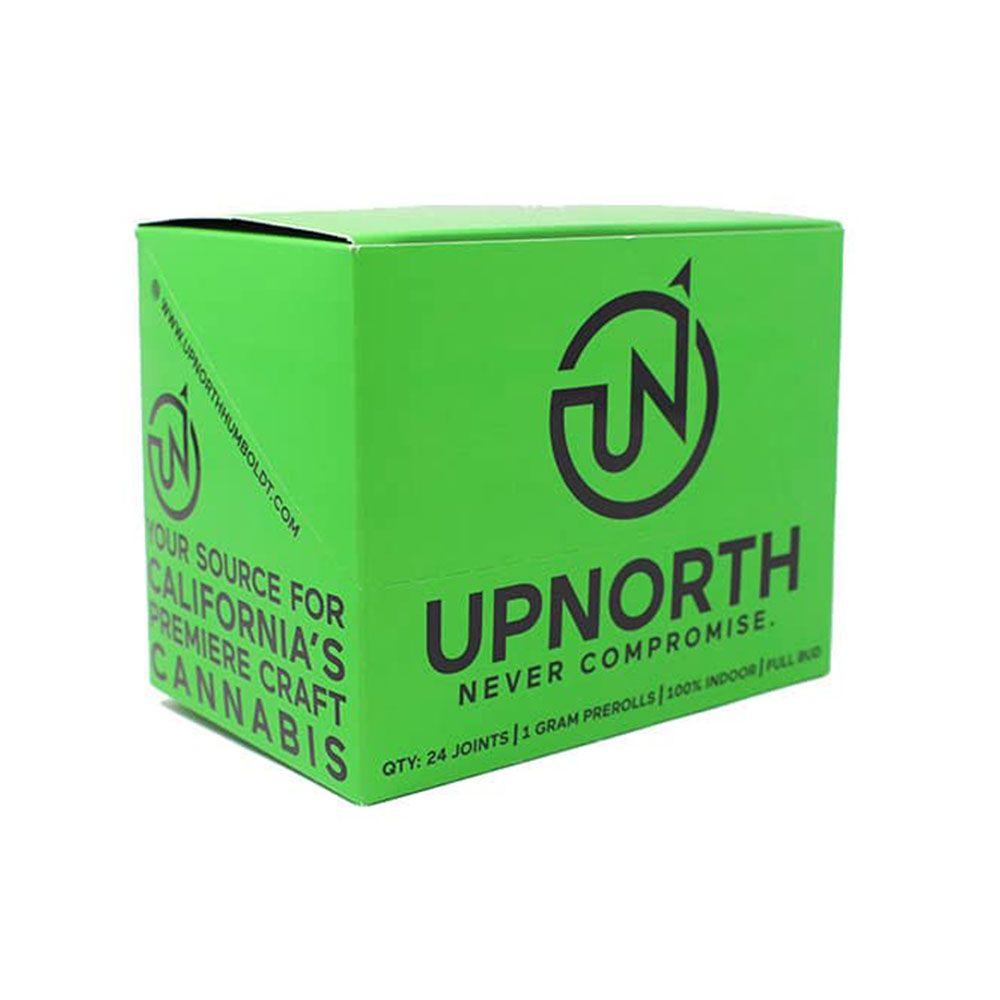
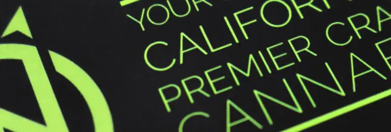
Rather than following the prevalent dark packaging trend, I flipped the traditional cannabis packaging model by promoting UpNorth’s signature green color to the forefront, using black only for text and detail work. This decision was rooted in both brand strategy and consumer psychology.
The vibrant green serves multiple purposes: it immediately differentiates UpNorth from competitors on crowded dispensary shelves, reinforces the natural, plant-based essence of cannabis products, and creates stronger brand recall. By making green the dominant color (covering approximately 70% of the visible surface area), the packaging becomes instantly recognizable even from a distance.
The strategic use of black typography and graphic elements creates strong contrast that ensures all regulatory information and product details remain highly legible while adding sophistication to the overall design. This approach allowed us to meet compliance requirements without sacrificing visual impact.
Production-Ready Design: Technical Precision
Adapting all artwork meticulously to match provided die lines was critical to ensure seamless mass production with no surprises at print time. This process involved:
- Die Line Integration: I worked directly with the packaging manufacturer’s technical specifications, ensuring every design element aligned perfectly with fold lines, glue tabs, and cut marks. This precision eliminated the risk of important design elements being lost in seams or creating structural weaknesses.
- Bleed and Safety Margins: All critical branding elements and required regulatory text were positioned within safe zones, while backgrounds extended properly into bleed areas to prevent white edges during the cutting process.
- Print File Optimization: Final files were prepared in industry-standard formats with proper color profiles (CMYK), resolution requirements (minimum 300 DPI), and layer organization that allowed the printer to efficiently manage the production workflow.
- Material Considerations: The design accounts for the specific cardboard stock being used, with ink coverage optimized to prevent cracking along fold lines and color choices that work well with the substrate’s natural texture.
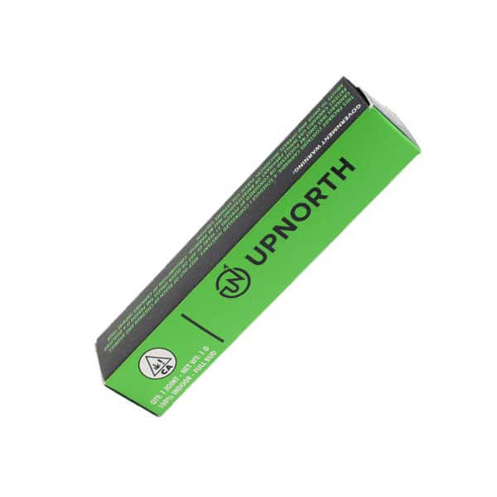
Visual Brand Cohesion: Creating a Unified System
Maintaining consistency across individual pre-roll boxes and bulk cartons was essential for creating a strong, unified product line on dispensary shelves. This cohesion extended beyond simply using the same colors.
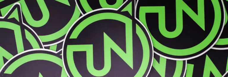
I developed a flexible design system with consistent typography hierarchies, icon styles, and graphic patterns that could scale appropriately across different package sizes. The brand’s logo placement, lockup, and clear space requirements were standardized to ensure recognition regardless of viewing angle or distance.
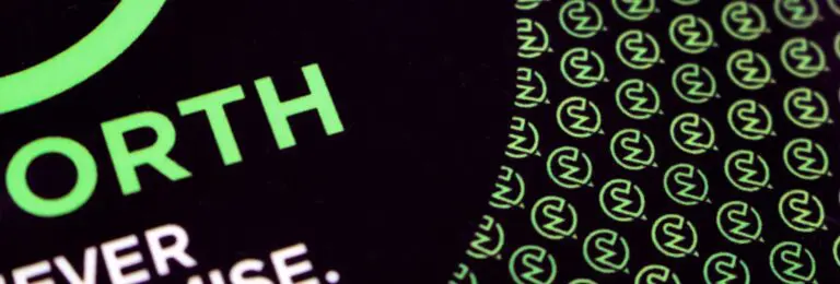
Pattern and texture elements were designed to be modular, allowing them to tile seamlessly across larger surfaces while maintaining visual interest at the smaller scale of individual pre-roll boxes. This systematic approach meant that whether a dispensary stocked individual units or bulk cartons, the UpNorth brand presence remained strong and cohesive.
The result: packaging that demanded attention and instantly communicated the brand’s freshness, quality, and distinction while functioning flawlessly in real-world production and retail environments.
The Outcome
The new packaging design delivered tangible results that exceeded initial project goals:
Measurable Business Impact
- Stronger shelf visibility and easier consumer recognition – Dispensary partners reported that UpNorth products now draw customer attention immediately upon entering the store, with the vibrant green packaging creating a distinctive visual anchor that customers navigate toward.
- Increased product interest and purchase rates in dispensaries – UpNorth saw a measurable uptick in sales velocity following the packaging rollout, with several retail partners reporting 25-30% increases in UpNorth pre-roll sales within the first two months of the new packaging hitting shelves.
- Enhanced brand loyalty through consistent, memorable presentation – Customer feedback indicated stronger brand recall, with dispensary budtenders noting that customers increasingly asked for UpNorth products by name rather than generic descriptions.
- Positive feedback from both retail partners and customers – Dispensary buyers appreciated the packaging’s durability and shelf appeal, while end consumers responded positively to the fresh, modern aesthetic that felt more premium than competitors at similar price points.
Long-Term Brand Benefits
The packaging redesign established a foundation for UpNorth’s continued brand evolution. The design system I created proved flexible enough to accommodate new product launches and seasonal variations while maintaining brand consistency. The production-ready file structure streamlined subsequent print runs, reducing time-to-market for new products and minimizing manufacturing delays.
Perhaps most importantly, the packaging became a conversation starter and marketing asset beyond the dispensary shelf. Customers began sharing photos of UpNorth products on social media, creating organic brand awareness that extended the packaging’s impact far beyond the point of sale.
UpNorth’s revamped look redefined how their products competed at the point of sale—turning packaging into a competitive advantage that continues to deliver value.
What The Client Said
“Andrew’s creative digital marketing services and approach to our packaging design has transformed how our products compete in the marketplace. The new design captures the essence of our brand while ensuring we stand out on the shelves. This has not only pleased our team but has also excited our customers who now easily recognize our products. Andrew has been instrumental in taking our brand visibility to new heights.”
– Geoffrey Hoopes, CEO, UpNorth
Related Graphic Design, Print Media Projects


Freelance Cannabis Packaging Design That Stands Out
Whether you’re launching a new cannabis brand or refreshing your product line, I design packaging that balances compliance, creativity, and competitive edge—turning shelf presence into sales momentum.